Best Friends Design System: Drupal Paragrphs
Link to Typography & Colors | Link to Design System (Adobe XD)
Quick links:
Action Team Signup
Banner
Body
Call to Action
Events
FAQ
Feature Cards (Box)
Five Card with Feature
Four Column Tile
Four Column View
From Library
Gallery
Headline
Hero - Card
Hero - Dashboard
Hero - Feature
Hero - Primary
Image
Impact Statement
Inverted Cards
Logos
People Cards
Program Cards(Round)
Social Media
Spacer
Subsection
Tableau Visualization
View (Animal Lists)
View (Conversion Ask)
View (Featured Stories)
View (Location Stories)
View (Network Partners)
Webform (Donation)
YouTube Video
Action Team Signup
User signup to join the action team.
The description text can be edited for each instance of the paragraph that is used.
Action Team Style options:
Standard— primary style that should be used on most pages
Simplified — a simplified version of the Standard style
Small— For use in the 60:40 paragraph on no-kill dashboards
Standard— primary style that should be used on most pages
Simplified — a simplified version of the Standard style
Small— For use in the 60:40 paragraph on no-kill dashboards
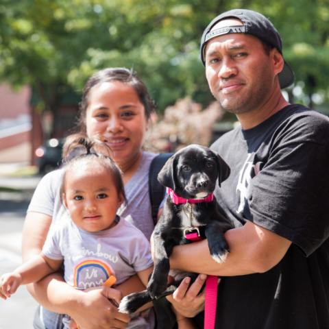
Webform (Action Team Signup) example:
Join your local grassroots action team
Find a local 2025 Action Team near you and learn how you can help create big change for the pets and people in your community today.
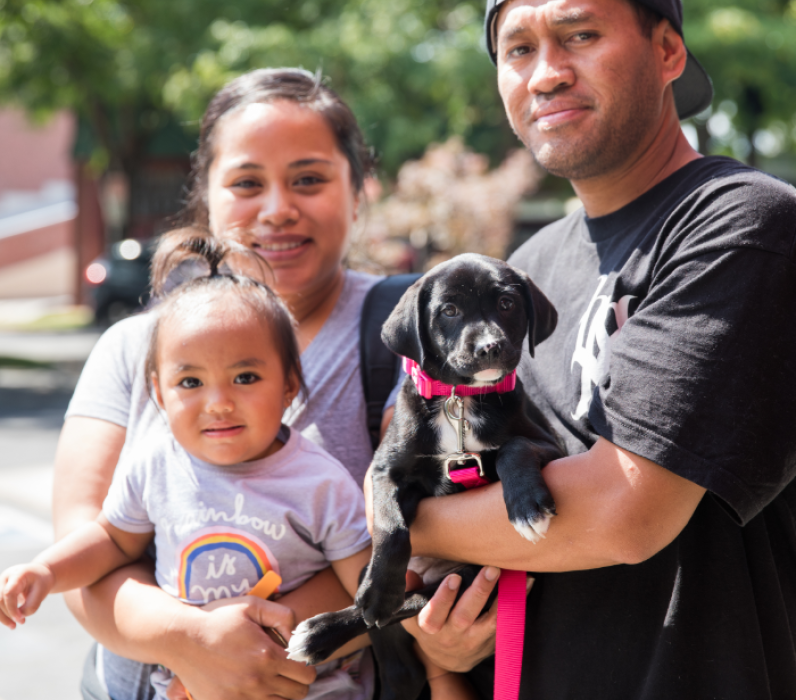
Join your local grassroots action team
Find a local 2025 Action Team near you and learn how you can help create big change for the pets and people in your community today.
Banner
Used to call out important text — primarily on the home page and landing pages.
Button is optional.
If “Call to Action” field is left blank, no button will display.
Bold and regular mixed font weight is acceptable for needed emphasis.
Banner background types:
Photo — uploaded image will be stretched to fit screen width (select focal point for mobile)
Tile — uploaded image will repeat across banner area (if transparent, background color will show through)
Color — solid color background in either Buff, Light Grey, Dark Slate, Orange, or White
Note: If using a photo, choose Dark Slate background in order for text to appear as white.
If using a transparent tile, the background color chosen will show through.
Banner examples:

Body
Standard body field. (Commonly used after headline paragraph.)
Content width:
Options are small, medium, and large. Small is standard width for copy that is more than a sentence or two. Use large and medium widths for special cases. Stories are limited to medium and small content widths only.
Text alignment:
Text can be aligned left or centered. *Only use center alignment in cases where text is limited and will not be more than 3 lines. (Text is always left aligned on mobile, even if center is chosen for desktop users.)
Buttons:
Use class=”bf-button” in the HTML source
Large button example: <a class="bf-button" href="/plan-your-visit">Plan Your Visit</a>
Small button example: <a class="bf-button-small" href="/plan-your-visit"> Plan Your Visit </a>
Body background types:
Photo — uploaded image will be stretched to fit screen width (select focal point for mobile)
Tile — uploaded image will repeat across screen width
Color — solid color background in either Buff, Light Grey, Dark Slate, or White
Note: If using a photo, choose Dark Slate background in order for text to appear as white. If using a transparent tile, the background color chosen will show through.
Body examples:
It’s the story of Best Friends, but it’s much more than the history of a spot on the map. This group of ordinary but passionate people believed that every pet has a story, too, each one worth saving, each life individual and important. Today, nearly four decades after they broke ground for a sanctuary in a remote region of the Southwest, achieving no-kill across the entire country is within reach.
Let’s be friends!
Connect with us on social media to stay in the loop about the lifesaving progress we’re making together.
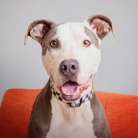
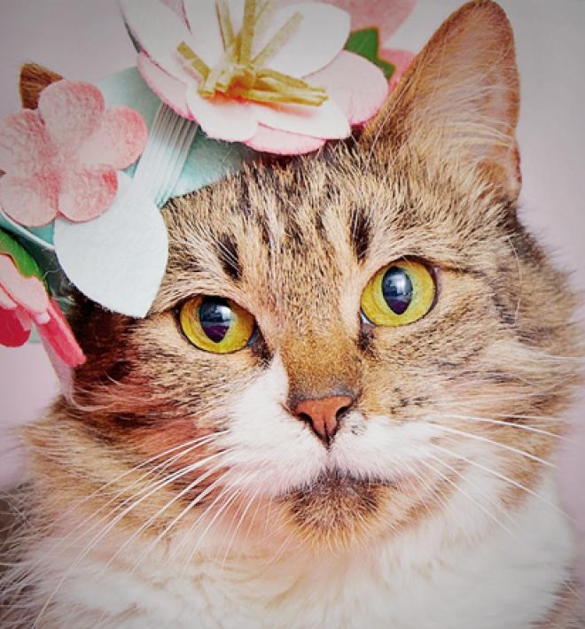
Image
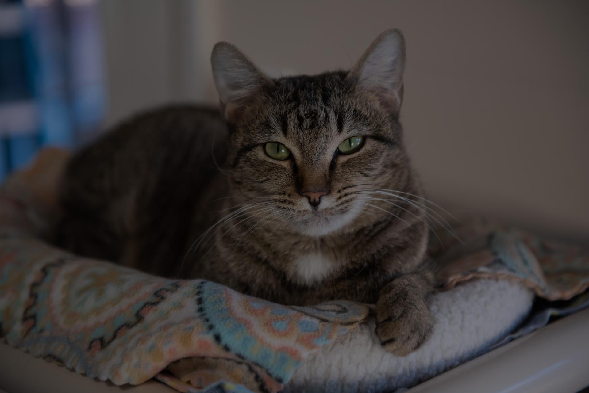
Cat HQ
Cat World Headquarters is where volunteers get assignments, ranging from taking cats for walks in strollers or on harnesses to helping with clicker training to cleaning and general caregiving. Cat HQ features 20 rooms and caters to cats who prefer to live alone or in small groups of two or three. A few rooms are set aside for kittens.
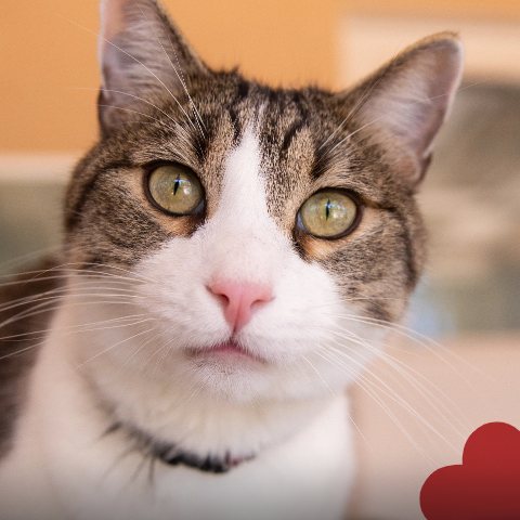
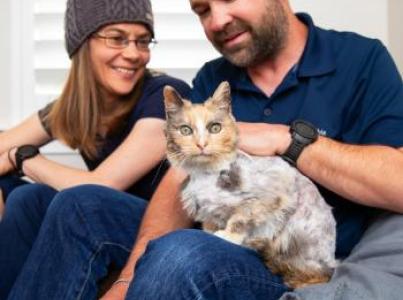
Call to Action
Used to feature specific content with user action.
The call to action paragraph height is fixed. Choose Full, Large, or Medium width. Ratios of image to the text panel are either 50:50 or 40:60. Image can appear on either left or right of text. (Default is image on left. Use checkbox to switch image to right.)
Image and headline are required. (Headlines have a 60 character limit. Body has 200 character limit.)
Body is optional. Text centers vertically within background color panel. Call to action (button or text link) is optional. Buttons should be used for calls to action like adopt, volunteer, and donate. Limit of 26 characters. Underlined links should be used for informational content such as features and blogs.
Text background color options are White, Light Grey, Buff, and Dark Slate
Note: If event dates are entered, the Call to Action Paragraph will hide once the event date has passed.
Call to Action examples:


Events
Add events to a page.
A view paragraph. Headline required. Subhead optional. Events loaded to matching story category term(s) and future dates.
Events are referenced from library at https://bestfriends.org/admin/content/event
If there are no events, paragraph will not display.
Events example:
Events: Make a difference for pets
Have fun and connect with fellow animal lovers through a variety of local and national events, big and small.

FAQ
Used to add common questions to page.
Consists of a title, background color, and question/answer pairs.
On desktop, displays in rows of 2.
Background color options are dark slate, light grey, buff, and white.
FAQ items are configured to populate Google FAQ schema.
FAQ examples:
Example FAQs
How many animals live at the Sanctuary?
The Sanctuary is home on any given day to around 1,600 animals, many of whom have special needs. Most of the animals are dogs and cats; the rest are horses, birds, rabbits, potbellied pigs, and an assortment of other animals.
Where do the animals come from?
Most of the animals come from Best Friends Network partners, which are located all around the country.
What is a "no-kill" sanctuary?
It's a sanctuary for homeless pets where animals are able to stay for as long as it takes them to find loving homes. Animals may still be euthanized humanely if they are irredeemably sick or injured, but they are not killed in order to make space for more animals.
What happens to the animals who are brought there?
Most of them are soon ready to go to good homes with loving families, making way for new arrivals. For the small number of animals who are never ready for adoption, the Sanctuary is their home for life.
Feature Cards (Box)
Use to highlight stories and other featured content.
Option for rectangular or square card images.
Rectangle cards are displayed in rows of three. Square cards can be displayed in rows of three or four.
Ideal title length is limited to 2 lines. Descriptions should not be longer than 3-4 lines on desktop.
If using a YouTube video, the card can pop a video in a modal window.
Option to hide images on mobile.
Feature Cards (Box) examples:

Five Card with Feature
Use to feature a key set of content pages.
First card created will always be displayed as the feature card (larger) on desktop.
Five Card with Feature example:
Act for Animals
We’re saving more animals now than at any point in our history, but our work isn’t done until every dog and cat gets the chance to know care and companionship … in a safe and loving home.

Four Column Tile Banner
Used to highlight adoptions, donations, fostering, etc. — primarily used on the home page and landing pages.
Tiles need to be 4 across with a maximum of 2 rows high on desktop
Number of tiles is optional for mobile (checkbox determines if a tile is viewable or hidden on mobile)
Tile styles:
Photo — a photo background with small link text in the bottom left corner of the tile (make sure photo is dark enough in the lower left corner for legibility)
Background Color — Dark slate or orange color background with white text and button (not available if photo is uploaded)
Note: Avoid using background color tiles side-by-side — place a photo tile between color tiles.
Optional: Title field is used specifically for local pages to identify the city/location (for example, Los Angeles, New York, Salt Lake City, etc. Leave title field blank in other use cases.
Four Column Tile examples:
-
Meet Slurpee
Help animals all year round by making a monthly gift today.
Give Monthly
-

Adopt Parker
-

Meet Hero
-
Sponsor Ruthie
-
Adopt Paco
Choose a Sanctuary animal to sponsor. Your gift helps find a loving home, spay/neuter, and much more.
Sponsor an Animal
-

Foster Fiver and Ten
-
Available Cats
Lorem ipsum dolor sit amet Los Angeles
Button Text
-
Available Dogs
Lorem ipsum dolor sit amet diam consetetur et
Button Text
Lorem ipsum dolor sit amet Los Angeles
Button Text
-
Available Dogs
Lorem ipsum dolor sit amet diam consetetur et
Button Text
-
Available Cats
Four Column View
Used to feature adoptable animals and special promotions.
Tiles utilize a list of taxonomy terms such as breed, color, age to load a random animal with matching terms.
Used for special promotions such as displaying black cats for Halloween or to feature older pets on adoption pages.
Use in groups of four.
Four Column View example:
Animal Previews
Animal Previews
Animal Previews
Animal Previews
From Library
Allows you to reuse a paragraph on multiple pages.
To create a reusable, library paragraph: When creating the paragraph, click the kabob icon and select "Promote to Library."
To reuse that library paragraph on other pages: Select "From Library" and choose the desired paragraph.
To edit a library paragraph: Go to Content > Paragraphs in the Admin menu. Note: Editing a paragraph in the Library, edits ALL instances of that paragraph on all pages where it is being used.
To use a library paragraph as a template for a new paragraph: Select "From Library" paragraph on a page. Then, click the kabab icon and select "unlink from library." Note: Any edits made to the unlinked paragraph will not affect the library version of that paragraph.
From Library example:


Headline
Use to add headlines above content.
Choose from H1, H2, H3, and H4.
Optional subhead in styles Subhead1 or Subhead2.
Choose from buff, dark slate, and light grey background to connect it to content that will follow the headline.
Headline is centered on desktop and left-aligned on mobile.
Headline examples:
H1 headline with subhead style 1 lorem ipsum dolor sit amet sed
Lorem ipsum dolor sit amet sed do eiusmod tempor incididunt ut labore
H2 headline with subhead style 2 lorem ipsum dolor sit amet sed
Dolor sit amet consectetur adipiscing elit sed do eiusmod tempor
H3 headline lorem ipsum dolor sit amet sed
H4 headline lorem ipsum dolor sit amet sed
Hero — Card
Limited use for important landing pages with a primary focus on imagery.
Utilizes headline. Two size options: tall and short.
Subhead is optional — limited to 3 lines max.
Optional use of video background. If video is added, image will not display. Video should be used sparingly.
Hero — Card example:
Welcome to Best Friends Animal Sanctuary
On any given day, Best Friends Animal Sanctuary is the healing home for up to 1,600 dogs, cats, birds, bunnies, horses, pigs and other animals.

Welcome to Best Friends Animal Sanctuary
On any given day, Best Friends Animal Sanctuary is the healing home for up to 1,600 dogs, cats, birds, bunnies, horses, pigs and other animals.
Hero — Dashboard
Hero option available to all custom pages.
Hero height options (desktop):
Standard — 1920w x 650h, preferred height, use for most cases (allows for more varied imagery)
Short — 1920w x 550h
Headline colors:
Text color options: white, black
Highlight color options: white, orange, dark slate (color for background behind text)
Body text and button are optional.
Hero image may be hidden on mobile. Use focal point for when hero image is shown on mobile.
Headline, optional body text, and button will display below the hero image on mobile. (Do not use body and button fields if using a subhead on desktop.)
Hero image may be hidden on mobile. Use focal point for when hero image is shown on mobile.
Headline, optional body text, and button will display below the hero image on mobile. (Do not use body and button fields if using a subhead on desktop.)
Hero — Dashboard examples:

Hero — dashboard, standard height

Hero — dashboard, short height
Optional body text lorem ipsum dolor sit amet. Ab quibusdam commodi sed iure ipsa ea voluptatem odio cum fugit sunt qui laborum temporibus ab dolores quos et eaque harum. Id sint consequatur sit nemo repellendus sit temporibus quidem.

Hero — dashboard, standard height, dark slate headline highlight
Hero — Feature
A hero with text independent of imagery and easily updatable.
Image has a choice of orange or gray shadow (image card color).
Background choices are light gray, buff, and white. Subhead optional.
Hero Feature examples:
Image

This is a hero feature example
Image
This is a hero feature example
Lorem ipsum dolor sit amet, consectetur adipiscing elit subheader optional
Hero — Primary
Only used on home page. Headline and call to action button required.
Only used on home page. Headline and call to action button required.
Separate images for desktop and for mobile. If a mobile image is not used, the desktop image is cropped to fit mobile, centered on the selected focal point.
Mobile image does not have text overlay. Text appears beneath image.
Hero — Primary example:

Working to save the lives of cats and dogs across America
Image
Use to display standalone images.
Size options:
Small — uses small margin width, height flexes based on aspect ratio
Medium — uses medium margin width, fixed height
Large Short — uses large margin width, fixed height
Large Tall — uses large margin width, fixed height
Full — full width imager, height flexes based on aspect ratio
Additional options: Optional caption. Option to display in modal on click.
Note: Medium and small are the only options for Stories.
Image examples:
Small Image

Optional caption for small size image with modal option.
Medium Image

Optional caption for medium size image.
Large Short Image

Optional caption for large-short size image.
Large Tall Image

Optional caption for large-tall size image.
Full Image

Optional caption for full width image.
Impact Statement
Used to highlight Best Friends organizational values.
Used in groups of three — on homepage only.
Impact Statement example:
Inverted Cards
Primarily used to highlight Local Program services.
Cards are displayed in rows of 4.
Character limits: Headline (optional) – 50 characters; Body– 100 characters
Optional "Service Category." Service category must be used on all cards, if chosen.
Background color options: buff, light grey, dark slate.
Inverted Card examples:
Los Angeles Services


Logos
Use to display columns of logos.
Displayed 3 or 4 across.
Logo examples:
People Cards
Use to feature people and quotes.
Displayed 3 across.
Quotes, title, and location are optional.
Please add quotes around your text if you would quotes to display. *If using a quote on one card, use a quote on all cards.
Program Cards (Round) examples:
"It is rewarding to work at Best Friends, I find endless motivation in the collective work we do because Best Friends celebrates the success of people and pets."
Rebekah
Manager, Brand Experience
Remote/Salt Lake City, UT

“The Best Friends mission and their approach matched my ideals perfectly and I knew it was a place I definitely wanted to work at.”
Leah
National Embed Program Specialist
Remote

“I’ve felt honored and grateful for every day with Best Friends, and I love getting to work with others that feel the same!”
Courtney
Lifesaving Outcomes Specialist
Los Angeles, California
Program Cards (Round)
Highlight available programs and other important featured content.
Choice of rows of 3 or 4.
Cards are displayed in order and can be reordered as needed.
Limit body copy to 3 lines (Desktop).
Do not use the YouTube video option when using round cards.
Square images can be uploaded and will be adjusted to fit the round image style.
Program Cards (Round) examples:


Social media
Use to embed an Instagram, facebook, or TikTok post on a page.
Caption required
Social media examples:
Spacer
Use to adjust spacing between paragraphs.
If two paragraphs do not have the desired default spacing, this paragraph can be used to add spacing where needed.
Height (gap size) is adjustable in REM increments. (1 REM is approximately 18px.) (Gap is halved on mobile.)
Optional background colors: Buff, Light Grey, Dark Slate
Spacer examples:
Two images without spacer between them


Two images with 6 REM spacer paragraph between them
Subsection
When using a headline, body text, and then a call to action, use the subsection paragraph.
Option to display an icon above the headline. When used, desired icon (graphic) size must be input at time of upload. Image must be png or svg.
Headline choice of H1, H2, or H3. Headline is automatically centered in medium margins.
Subhead choice of Subhead1 or Subhead2 style. Subhead is automatically centered in medium margins.
Body text is automatically left aligned and fits small margin width.
Call to Action is centered and can be a button (small or large) or an underlined link.
Small text can appear after call to action, if needed. (Post body)
Optional background colors for subsection paragraph: Buff, Light Grey, Dark Slate, White
Small text can appear after call to action, if needed. (Post body)
Optional background colors for subsection paragraph: Buff, Light Grey, Dark Slate, White
Subsection example:
Explore what makes the Sanctuary extraordinary
Tucked into the majestic canyons of southern Utah, the Sanctuary is truly a place like no other. See for yourself what a magical place it is.
Red-rock vistas meet endless blue skies as the sweet smell of sage lingers in the air. The beauty of the landscape is dwarfed only by the exquisite show of resilience and trust of the animals who come here — and by the love and compassion offered by Best Friends’ members, volunteers and caregivers.
Tableau Visualization
Used to add a Tableau visualization iFrame to a page.
If used by itself, margin choices are: full width, standard, or wide.
A separate mobile visualization can be added. If a mobile visualization is not added, the desktop visualization will be rendered on mobile.
A placeholder background image for mobile and/or desktop can be uploaded.
Parameters may be used to add filters to the visualization.
Tableau Visualization example:
PetLifesavingDesktop/National?:linktarget=_parent
PetLifesavingMobile/National?:linktarget=_parent
View (Animal Lists)
Displays location specific adoptable cats or adoptable dogs to local programs sections of the website.
Step 1: Add the view to page.
Choose the "Add View" paragraph to add to the page.
Select a margin width: full width, standard, or wide. *Full width is recommended.
Select the View Block "Animal Lists."
Under "Display ID," select "Adoptable Cats," "Adoptable Dogs," or Adoptable Dogs & Cats."
Step 2: Find the IDs for the Adoption Location(s) to be used.
Go to Structure > Taxonomy > Adoption Locations
Click the edit button for the location(s) required
Copy the locations ID from the URL (/taxonomy/term/[numerical ID]/edit)
Step 3: Enter IDs into the View paragraph.
Return to the View paragraph, select "OPTIONS," and enter the ID for the desired adoption location.
If there is more than one location, add their IDs with a "+" between the IDs. For example, 66448+66449.
Note: View (Network Partners) and View (Animal List) should never be used on the same page. When used on the same page, the Animal List View overwrites some of the styles in the Network Partners View and the display will be inaccurate.
View (Conversion Ask)
Displays conversion ask cards as one large call to action or four small call to action cards. Cards displayed in this view are Conversion Ask media items.
If the Conversion Ask(s) have not been created:
Go to Content > Media > Add media > Conversion Ask
Add the Conversion Ask(s) with the appropriate category or categories.
Step 1: Add the view to page.
Choose the "Add View" paragraph to add to the page.
Select a margin width: full width, standard, or wide. *Full width is recommended.
Select the View Block "Conversion Ask."
Under "Display ID," select either "4 Column" or "Single." (4 Column displays four small cards in a single row. Single displays one large card.)
Step 2: Find the IDs for the story categories to be used.
Go to Structure > Taxonomy > Story Categories
Click the edit button for the categories required
Copy the category ID from the URL (/taxonomy/term/[numerical ID]/edit)
Step 3: Enter IDs into the View paragraph.
Return to the View paragraph, select "OPTIONS," and enter the ID for the desired story categories.
If there is more than one category, they can be added with a "+" or "," between them. For example, 66369+484 or 66369, 484
Use the "+" for any story that has at least one Story Category. Use the "," for stories that have ALL of the Story Categories.
Note: Conversion Ask cards are displayed in order based on the value in the cards weight field with the height weights getting priority. If the weights are the same, the most recently updated Conversion Ask will display.
View (Conversion Ask) examples:

View (Featured Stories)
Dynamically pulls stories with story categories that match page content.
The Featured Stories View is enabled by adding the "View" paragraph to a page. For no-kill dashboard pages, select "Featured Stories + NP" to also pull in key pages from the Network Partners site.
Step 1: Add the view to page.
Choose the "Add View" paragraph to add to the page.
Select a margin width: full width, standard, or wide. *Full width is recommended.
Select the View Block "Featured Stories."
Under "Display ID," select either "Featured Stories" or "Featured Stories + NP."
Step 2: Find the IDs for the story categories to be used.
Go to Structure > Taxonomy > Story Categories
Click the edit button for the categories required
Copy the category ID from the URL (/taxonomy/term/[numerical ID]/edit)
Step 3: Enter IDs into the Featured Stories View paragraph.
Return to the Featured Stories View paragraph, select "OPTIONS," and enter the ID for the desired story categories.
If there is more than one category, they can be added with a "+" or "," between them. For example, 66369+484 or 66369, 484
Use the Featured Stories (OR) and "+" if you want any story that has at least one story ategory. Use the Featured Stories (AND) and "," if you only want stories that have ALL of the story categories
For a story to be available for this view, the story must have the "Generate Feature Card" checkbox selected.
For a Network Partner basic page to be available, the page must have the "Generate Feature Card" checkbox selected.
View (Featured Stories) example:
View (Location Stories)
Dynamically pulls stories filtered by location.
Step 1: Add the view to page.
Choose the "Add View" paragraph to add to the page.
Select a margin width: full width, standard, or wide. *Full width is recommended.
Select the View Block "Location Stories."
Step 2: Find the IDs for the locations to be used.
Go to Structure > Taxonomy > Story Categories.
Find the "Our Local Programs" section.
Click the edit button for the Location required (example: Los Angeles).
Copy the Location ID from the URL (/taxonomy/term/[numerical ID]/edit)
Step 3: If further filters by story category are needed, repeat step 2 and find the desired Story Categories taxonomy.
Step 4: Enter IDs into the Locations View paragraph.
Return to the Location Stories View paragraph, select "OPTIONS," and enter the ID for the desired location.
If you ust want to filter by the Location, enter the Location ID. For example: 535 would show all Los Angeles stories.
If you do want to filter by an additional Story Category, add the Categoryhey can be added with a "+". For example: 535+542 which would show all Los Angeles (535) stories about Adoption Events (542).
Note: Filters added above the view are a body paragraph.
View (Location Stories) example:


View (Partners)
Provides functionality for users to find nearby Partners.
The Partners view can be added by adding the View paragraph to a page. There are two version: All Partners shows all Network, NKLA, NKUT, and NWA PAWS partners. The other allows users to select what partner types to display. If you choose the second, you need to add the ID of the partner type from the Partner Type taxonomy (example: 66532 for network)
Users can search by zipcode. The first 10 results will display.
Button to "find more Network Partners" takes user to primary Network Partner search page with filter parameters preserved.
Full width is recommended.
Notes:
The text above the Partner fields is a body field. The template can be found in the Paragraph Library.
View (Partners) and View (Animal List) should never be used on the same page. When used on the same page, the Animal List View overwrites some of the styles in the Network Partners View and the display will be inaccurate.
View (Partners) example:
Find a Best Friends Network partner near you
The Best Friends Network is made up of thousands of public and private shelters, rescue groups, spay/neuter organizations and other animal welfare groups, all working to save the lives of dogs and cats in communities like yours across the country.
Each and every one of our network partners needs caring people like you to adopt, foster, donate, volunteer and advocate to help save the lives of pets where you live.
Find a network partner near you today:
Webform (Donation)
Simple form displaying monetary donation options for users to donate. Primarily used on home page.
Donation form can be added by adding the Webform paragraph to a page.
The form allows for quick selections of dollar amounts or a custom donation value.
Webform (Donation) example:
Video Embed
Used to embed a YouTube, Widen, or Vimeo video on a custom page.
The embedded video plays within the frame on the page.
Size can be set to small or medium.
Background color options are Buff, Light Grey, Dark Slate, and White.
Use in conjunction with headline paragraph and spacer paragraph (with matching background color), as needed.
Can be used next to a body paragraph.
Video Embed examples: